Wag Buys Shares Back from SoftBank
Wag was looking to raise $75 million. It went to SoftBank and was like “will you give us $75 million?” SoftBank was like “no haha we’ll give you $300 million,” because that is SoftBank’s whole thing, it loves to give startups vastly more money than they want or need. And so Wag took the money. And then like a year and a half later Wag will get rid of SoftBank by giving back, I don’t know, but I am going to say some number less than $225 million (“well below” the valuation at which it invested). Wag got the $75 million it needed for free.
So under the right circumstances, you can make more money with a flop than you can with a hit!
Wag wasn’t exactly a flop, but SoftBank’s aggressive investment strategy does result in some pretty unusual situations.
Leather Sneakers by Spingle
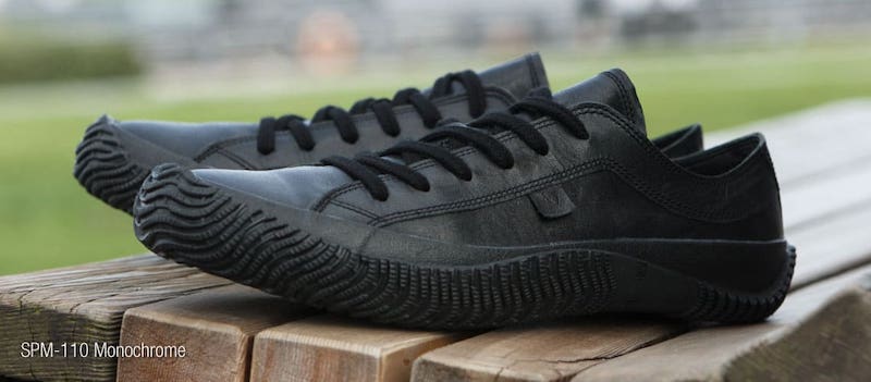
Spingle is a company based in Hiroshima, Japan that makes hand-crafted leather shoes, and they also have an excellent sneaker lineup. Because the leather molds to your feet over time, the shoes become more comfortable the more you wear them.
They are a little pricey, but they should last a long time and the cost is completely reasonable considering the work that goes into them. And there are plenty of sneakers that cost even more.
An AI That Begins Novels
This neural network was trained to output unique opening lines to novels. Some of the results are surprisingly great:
I have just been informed, that the debate over the question ‘is it right or wrong to have immortal souls’ has been finally brought to a conclusion.
When I was a boy, I was fond of the story of the pirate god.
He had a strange name, and he was a very big boy indeed.
The village of Pembrokeshire, in the county of Mersey, lies on a wide, happy plain, which, in a few years, was to become known as the “Land of the Endless Mountains.”
I was playing with my dog, Mark the brown Labrador, and I had forgotten that I was also playing with a dead man.
How many times have I had the misfortune to die?
The first day I met my future self, I was aboard the old dirigible that lay in wait for me on the far side of the moon.
It’s hard to call these creative since the AI probably has no concept of what these words actually mean, but there are some really compelling ideas in here.
The last sentence in particular struck me as having so many interesting elements that could be explored more as the story progresses. At the very least, these serve as excellent starting places for ideas that a normal person wouldn’t have on their own.
Shape Up - How Basecamp does Product Development
Shape Up is an amazing new web-book by Basecamp that details the process they use to define, build, and ship their products. It has great insights, but I especially appreciated how many of the ideas presented just make a lot of sense. I often nodded along in agreement and recognized concepts that we share in our team. The framework is battle-tested and realistic, and there’s a good chance I’ll be able to integrate some new ideas into our existing workflow without having to reorganize how we think about everything to fit a new metaphor.
What I found the most impressive was how clearly they have defined the key ideas and concepts behind their process. Even if your team can find a groove and settle into a good way to work effectively, it takes a lot more effort to recognize why these things work and how they can be reproduced in different situations. Reading this document helped to solidify a lot of ideas I had encountered before but not fully appreciated.
The full document deserves a thorough read-through, but here is a summary of the main points for quick reference:
- Raw ideas are shaped into a concept pitch, with implementation details left open for the team to work out.
- Pitches are considered at a betting table and chosen for six-week work cycles.
- Small teams of developers and designers will be given a shaped concept and six uninterrupted weeks to finish.
- Work is broken up into scopes that incorporate front and back-end work. Scopes are finished roughly in sequence.
- The status of scopes is displayed as being uphill (still containing unknowns) or downhill (solved and being executed)
- The work must be shipped within the allotted time. Unfinished work won’t get an extension
- Meanwhile, new concepts are shaped in parallel. The next betting table is held during a two-week cooldown between cycles.
Ōkunoshima - The Island of Bunnies
Located east of Hiroshima in the Seto Inland Sea, Ōkunoshima (大久野島) is a small island home to over 700 rabbits. The rabbits are wild but friendly, and tourists arrive every day with bags full of food and treats. The island was relatively unknown in Japan until recently when its populality among foreign visitors brought it into the spotlight.
NAVA Ora Unica Wristwatch
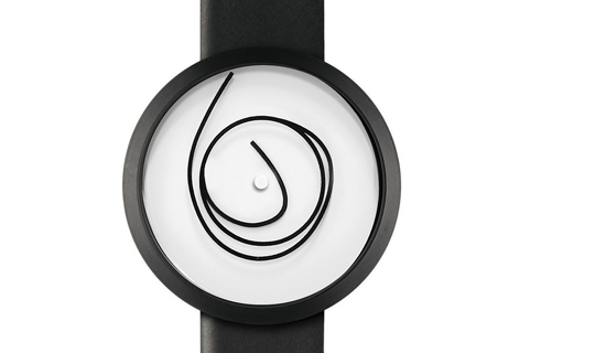
I happened upon this watch in the mall over the weekend and loved how unconventional it is. The inner end of the loop acts as the hour hand, and the outer end is the minute hand. The in-between part seems to move freely, so you have a watch face that looks pretty different each time you look at it.
I’d probably need to pause for a few seconds to decipher the time so it’s not exactly practical, but it would be a good conversation starter for sure.
Adding CSS Support for Dark Mode
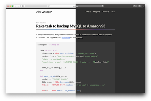
macOS Mojave added a system-wide Dark Mode, but it doesn’t do much if all of the websites you see are still bright white. To address this, there is a new CSS media query prefers-color-scheme that can detect Dark Mode and change styles accordingly. There are three possible values: no-preference, light, and dark. You can read more in the W3C specification.
This new option looks to be supported in Safari 12.1 and Firefox 67. As of this writing both of these have not been released officially, but you can try it out in the Safari Technology Preview
I’ve added Dark Mode support to this site, using code that looks something like this
@media (prefers-color-scheme: dark) {
  body {
    color: $text-color-dark;
    background-color: $background-color-dark;
  }

  img { opacity: 0.9 }

}
You should probably tweak colors a bit more than simply switching black and white to keep things looking nice, and I found that reducing image opacity can help to reduce the contrast with bright pictures.
The First Image of a Black Hole

For the first time ever, scientists have captured an image of a black hole. The black hole chosen is a supermassive black hole at the center of the Messier 87 galaxy, 55 million light-years away from Earth. This is huge news, since before this we only had theoretical proofs of black holes with no direct evidence.
A black hole technically doesn’t look like anything since it emits no light, so I understand this to be a capture of light that came very close to the black hole. It appears in a very distinct way that confirms the presence of a black hole.
This is a photograph of a tiny amount of light that has spilled away from a black hole, 55 million light-years away. The fact that we have telescopes that can accurately capture that light is mind-boggling.
Black holes have so much gravity that any light that comes close enough will bend in a very noticeable way. Light that came from our direction can even curve around the black hole and come back at us. The ring that we see around the black hole is actually light that has come from all different directions, which have curved to end up reaching us. One side appears brighter because the black hole is spinning very fast, and the light that was pushed towards us with the spin experiences something like the Doppler Effect for sound.
This video by Veritasium does a great job describing what exactly is happening. Although it was released in anticipation of the actual image, the results were exactly as predicted.
Natural Lighting in the Office
I’ve come to learn that I really enjoy working in environments with only natural lighting. At my job, I work in a large open room with about 50 people. Many of them are artists who need to minimize the glare on their screens, so the great big windows covering the walls of our room are always covered with blinds, and we instead have fluorescent lights turned on (these do cause glare too, but at least they are more predictable so people can tilt their screens to minimize it).
But every once in a while, I’ll be in the office on a weekend, or early in the morning, and I’ll have the room to myself. The lights stay off, the blinds come down, and I immediately feel peaceful and refreshed. I’m noticeably happier and feel great while I’m working. At home too, I’ve set up my desk next to the window and I love the light that comes in from outside. Now that I’m aware that this is something that has a big impact on me, I’ll do my best to seek out environments with natural lighting in the future.
Generating Colors from Post Titles
This blog has an intentionally simple design, but lately I’ve been thinking that it needs more color. A lot of the posts don’t have images and are just text, so large areas of the page are black and white with nothing visually interesting. That said, trying to include an image with every post is a pain. I would probably spend more time browsing stock images than actually writing the posts.
Picular was a big inspiration. Generating colors from text by searching for images is a great idea, and I decided to automatically get a set of colors based on each post’s title. Picular doesn’t have an API that I could use, so I wrote a quick script that does something similar. Unless I’ve changed things since I published this post, there should now be a row of colors next to each post’s title.
Getting colors from images
I’ve included the script itself at the end of the post so you can the details of how it works, but the general process is as follows:
- Do a Google Image search for the title of the post
- Get the first five images
- For each image, find the color that is most prominent
- Save the list of colors to the post
Here are the results for the title “My Vacation in Tahiti”:
 |
 |
 |
 |
 |
| #626E6F | #53C2D6 | #7693C6 | #39547B | #515E65 |
After playing around with it, I found that just looking at the most frequently used color usually isn’t good enough. Most of the time you just end up with a lot of black and white. Instead of looking for the most common color, I should instead look for the most interesting color. There is a lot of room for optimization here, and Picular probably does a lot behind the scenes to make its results visually appealing. For now, I’m just ignoring any colors that are close to black or close to white. So far it’s working well enough for my uses.
Even with these adjustments, this method tends to find a lot of colors that are either very dark or very bright. The colors often felt too strong compared to the rest of the site’s design. I thought about doing some adjustments to the colors to tone them down, but realized that it’s much easier to cheat by reducing the opacity of the colorful bars via CSS.
I now also include this script in the rake task that generates my post files for Jekyll, so after I write a post it will automatically fetch colors before publishing. I might write another post about how that works, but for now you can see the file here (sorry if I’ve changed things since I wrote this and it’s no longer there).